
Now, we will study the concept of a decision boundary for a binary classification problem. We use synthetic data to create a clear example of how the decision boundary of logistic regression looks in comparison to the training samples. We start by generating two features, X1 and X2, at random. Since there are two features, we can say that the data for this problem are two-dimensional. This makes it easy to visualize. The concepts we illustrate here generalize to cases of more than two features, such as the real-world datasets you’re likely to see in your work; however, the decision boundary is harder to visualize in higher-dimensional spaces.
Perform the following steps:
- Generate the features using the following code:
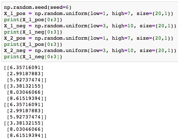
np.random.seed(seed=6)
X_1_pos = np.random.uniform(low=1, high=7, size=(20,1))
print(X_1_pos[0:3])
X_1_neg = np.random.uniform(low=3, high=10, size=(20,1))
print(X_1_neg[0:3])
X_2_pos = np.random.uniform(low=1, high=7, size=(20,1))
print(X_1_pos[0:3])
X_2_neg = np.random.uniform(low=3, high=10, size=(20,1))
print(X_1_neg[0:3])
You don’t need to worry too much about why we selected the values we did; the plotting we do later should make it clear. Notice, however, that we are also going to assign the true class at the same time. The result of this is that we have 20 samples each in the positive and negative classes, for a total of 40 samples, and that we have two features for each sample. We show the first three values of each feature for both positive and negative classes.
The output should be the following:
Generating synthetic data for a binary classification problem
- Plot these data, coloring the positive samples in red and the negative samples in blue. The plotting code is as follows:
plt.scatter(X_1_pos, X_2_pos, color='red', marker='x')
plt.scatter(X_1_neg, X_2_neg, color='blue', marker='x')
plt.xlabel('$X_1$')
plt.ylabel('$X_2$')
plt.legend(['Positive class', 'Negative class'])
The result should look like this:
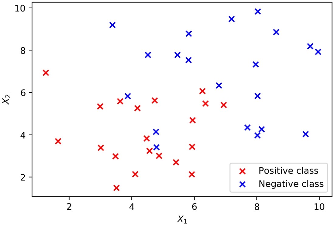
Generating synthetic data for a binary classification problem
In order to use our synthetic features with scikit-learn, we need to assemble them into a matrix. We use NumPy’s block function for this to create a 40 by 2 matrix. There will be 40 rows because there are 40 total samples, and 2 columns because there are 2 features. We will arrange things so that the features for the positive samples come in the first 20 rows, and those for the negative samples after that.
- Create a 40 by 2 matrix and then show the shape and the first 3 rows:
X = np.block([[X_1_pos, X_2_pos], [X_1_neg, X_2_neg]])
print(X.shape)
print(X[0:3])
The output should be:
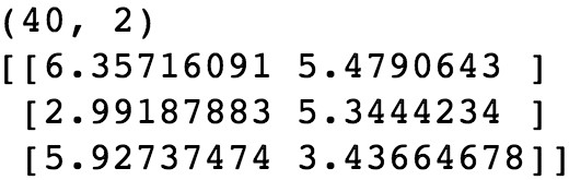
Combining synthetic features in to a matrix
We also need a response variable to go with these features. We know how we defined them, but we need an array of y values to let scikit-learn know.
- Create a vertical stack (vstack) of 20 1s and then 20 0s to match our arrangement of the features and reshape to the way that scikit-learn expects. Here is the code:
y = np.vstack((np.ones((20,1)), np.zeros((20,1)))).reshape(40,)
print(y[0:5])
print(y[-5:])
You will obtain the following output:
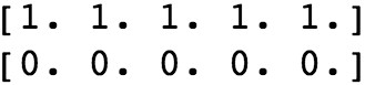
Create the response variable for the synthetic data
At this point, we are ready to fit a logistic regression model to these data with scikit-learn. We will use all of the data as training data and examine how well a linear model is able to fit the data.
- First, import the model class using the following code:
from sklearn.linear_model import LogisticRegression
- Now instantiate, indicating the liblinear solver, and show the model object using the following code:
example_lr = LogisticRegression(solver='liblinear')
example_lr
The output should be as follows:
Fit a logistic regression model to the synthetic data in scikit-learn
- Now train the model on the synthetic data:
example_lr.fit(X, y)
How do the predictions from our fitted model look?
We first need to obtain these predictions, by using the trained model’s .predict method on the same samples we used for model training. Then, in order to add these predictions to the plot, using the color scheme of red = positive class and blue = negative class, we will create two lists of indices to use with the arrays, according to whether the prediction is 1 or 0. See whether you can understand how we’ve used a list comprehension, including an if statement, to accomplish this.
- Use this code to get predictions and separate them into indices of positive and negative class predictions. Show the indices of positive class predictions as a check:
y_pred = example_lr.predict(X)
positive_indices = [counter for counter in range(len(y_pred)) if y_pred[counter]==1]
negative_indices = [counter for counter in range(len(y_pred)) if y_pred[counter]==0]
positive_indices
The output should be:
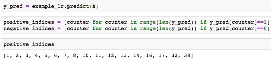
Positive class prediction indices
- Here is the plotting code:
plt.scatter(X_1_pos, X_2_pos, color='red', marker='x')
plt.scatter(X_1_neg, X_2_neg, color='blue', marker='x')
plt.scatter(X[positive_indices,0], X[positive_indices,1], s=150, marker='o',
edgecolors='red', facecolors='none')
plt.scatter(X[negative_indices,0], X[negative_indices,1], s=150, marker='o',
edgecolors='blue', facecolors='none')
plt.xlabel('$X_1$')
plt.ylabel('$X_2$')
plt.legend(['Positive class', 'Negative class', 'Positive predictions', 'Negative predictions'])
The plot should appear as follows:
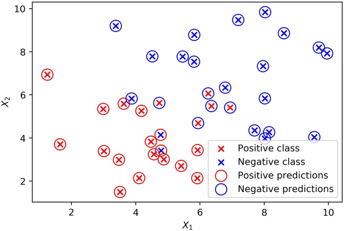
Predictions and true classes plotted together
From the plot, it’s apparent that the classifier struggles with data points that are close to where you may imagine the linear decision boundary to be; some of these may end up on the wrong side of that boundary. Use this code to get the coefficients from the fitted model and print them:
theta_1 = example_lr.coef_[0][0]
theta_2 = example_lr.coef_[0][1]
print(theta_1, theta_2)
The output should look like this:
![]()
Coefficients from the fitted model
- Use this code to get the intercept:
theta_0 = example_lr.intercept_
Now use the coefficients and intercept to define the linear decision boundary. This captures the dividing line of the inequality, X2 ≥ -(1/2)X1 – (0/2):
X_1_decision_boundary = np.array([0, 10])
X_2_decision_boundary = -(theta_1/theta_2)*X_1_decision_boundary - (theta_0/theta_2)
To summarize the last few steps, after using the .coef_ and .intercept_ methods to retrieve the model coefficients 1, 2 and the intercept 0, we then used these to create a line defined by two points, according to the equation we described for the decision boundary.
- Plot the decision boundary using the following code, with some adjustments to assign the correct labels for the legend, and to move the legend to a location (loc) outside a plot that is getting crowded:
pos_true = plt.scatter(X_1_pos, X_2_pos, color='red', marker='x', label='Positive class')
neg_true = plt.scatter(X_1_neg, X_2_neg, color='blue', marker='x', label='Negative class')
pos_pred = plt.scatter(X[positive_indices,0], X[positive_indices,1], s=150, marker='o',
edgecolors='red', facecolors='none', label='Positive predictions')
neg_pred = plt.scatter(X[negative_indices,0], X[negative_indices,1], s=150, marker='o',
edgecolors='blue', facecolors='none', label='Negative predictions')
dec = plt.plot(X_1_decision_boundary, X_2_decision_boundary, 'k-', label='Decision boundary')
plt.xlabel('$X_1$')
plt.ylabel('$X_2$')
plt.legend(loc=[0.25, 1.05])
You will obtain the following plot:
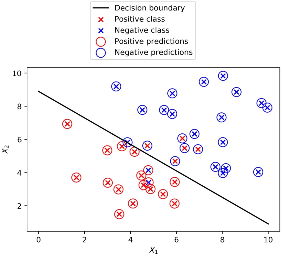
True classes, predicted classes, and the decision boundary of a logistic regression
In this post, we discuss the basics of logistic regression along with various other methods for examining the relationship between features and a response variable. To know, how to install the required packages to set up a data science coding environment, read the book Data Science Projects with Python on Packt Publishing.